Personal Data Projects
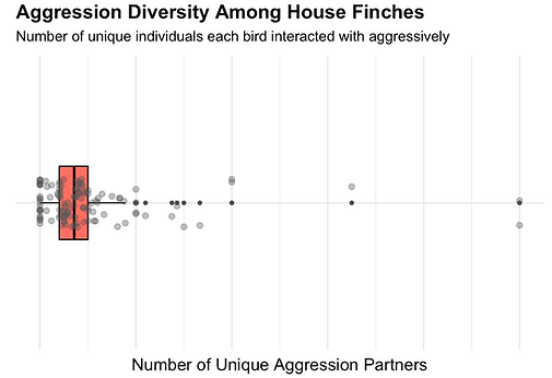
Birds of a Networked Feather: Visualizing Social Structure and Behavior in House Finches
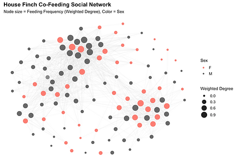
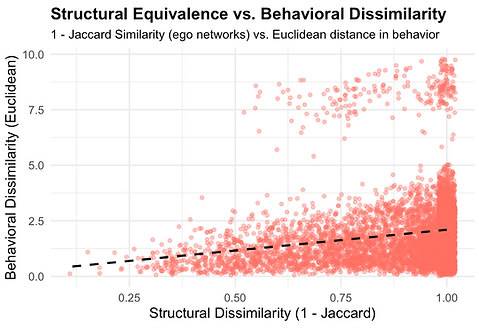
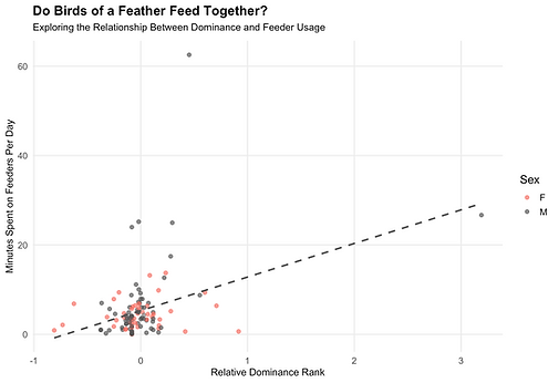
I independently designed and analyzed this series of visualizations to investigate the social dynamics of house finches through the lens of network science and behavioral ecology. Using a rich dataset of co-feeding interactions collected via RFID technology, I constructed undirected social networks where nodes represent individual birds and edges reflect the frequency of co-occurrence at feeders.
By integrating community detection, structural equivalence metrics, linear regression, and diversity indices, I visualized and interpreted complex relationships between dominance, feeder usage, and aggression. This work provided insight into how birds form ties, assert status, and navigate the balance between competition and cooperation within their social groups. Each visualization in this series reflects a different lens on that broader question — revealing the multifaceted, emergent properties of a wild animal social system.

Star Wars Viewership: Waffle Chart & Pie Chart
A more fun personal project, for this analysis of Star Wars viewers by age group and gender, I used R with ggplot2 for data visualization and tidyverse for data wrangling. The waffle package was utilized to create a visually intuitive waffle chart, effectively representing proportional audience demographics. Additionally, I designed a clean and informative pie chart using ggplot2, leveraging forcats to manage categorical variables. The dataset, sourced from FiveThirtyEight, was processed using dplyr to ensure accurate aggregation and meaningful insights into Star Wars fandom demographics.
LeBron James Visualization
For this basketball shot chart, I used R with ggplot2 and webscraping automation tools for visualizing LeBron James’ shot attempts and efficiency during the 2013 and 2020 championship runs. I processed the data using dplyr and tidyverse, ensuring clean and structured datasets before plotting. The court design and shot markers were customized using ggplot2's layering system, providing a clear and engaging comparison of his shot distribution over time.

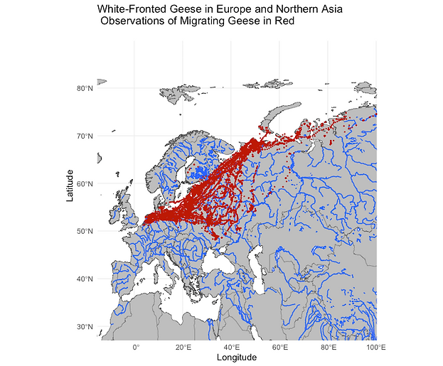
Geospatial Visualization
This geospatial visualization was created in R using ggplot2 and sf to plot migration patterns of White-Fronted Geese across Europe and Northern Asia. The base map was built using rnaturalearth, while ggmap and ggspatial were used to overlay geolocation data. The dataset was processed with dplyr to extract relevant observations, ensuring an accurate and informative representation of migration trends.
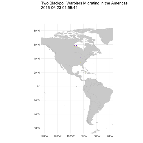
Geoanimation
For this geospatial animation of Blackpoll Warbler migration across the Americas, I used R with ggplot2, gganimate, and sf to visualize movement patterns over time. The animation was built using gganimate, which allowed for a dynamic representation of the birds' seasonal migration. Spatial data was processed with sf and rnaturalearth, while dplyr was used for data wrangling and filtering. This project highlights the warblers' incredible journey, providing an engaging way to explore avian migration through data visualization.